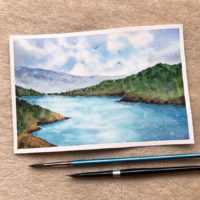


In this tutorial I’m going to guide you through the creation of a seascape, I divided the process video so that you can procede step by step. If you decide to give it a try I suggest to first take a look at all the videos and read the notes and then start painting watching every video one by one for the second time, this would give you a good general idea of the painting and ensures you won’t miss any steps along the way.
Remember to be patient when it’s needed and wait for the wet areas to dry out if you want to draw crisp strokes on them.
As a side note I usually tend to mix colors and never use them in their “pure” form, apart for some exceptions.
I’m also going to name the colors i used (you can find a complete list of the watercolors i used at the end of this post) but you can chose your palette and use different colors from different brands, it shouldn’t affect the final result!
Without further ado, let’s dive into it!
Supplies
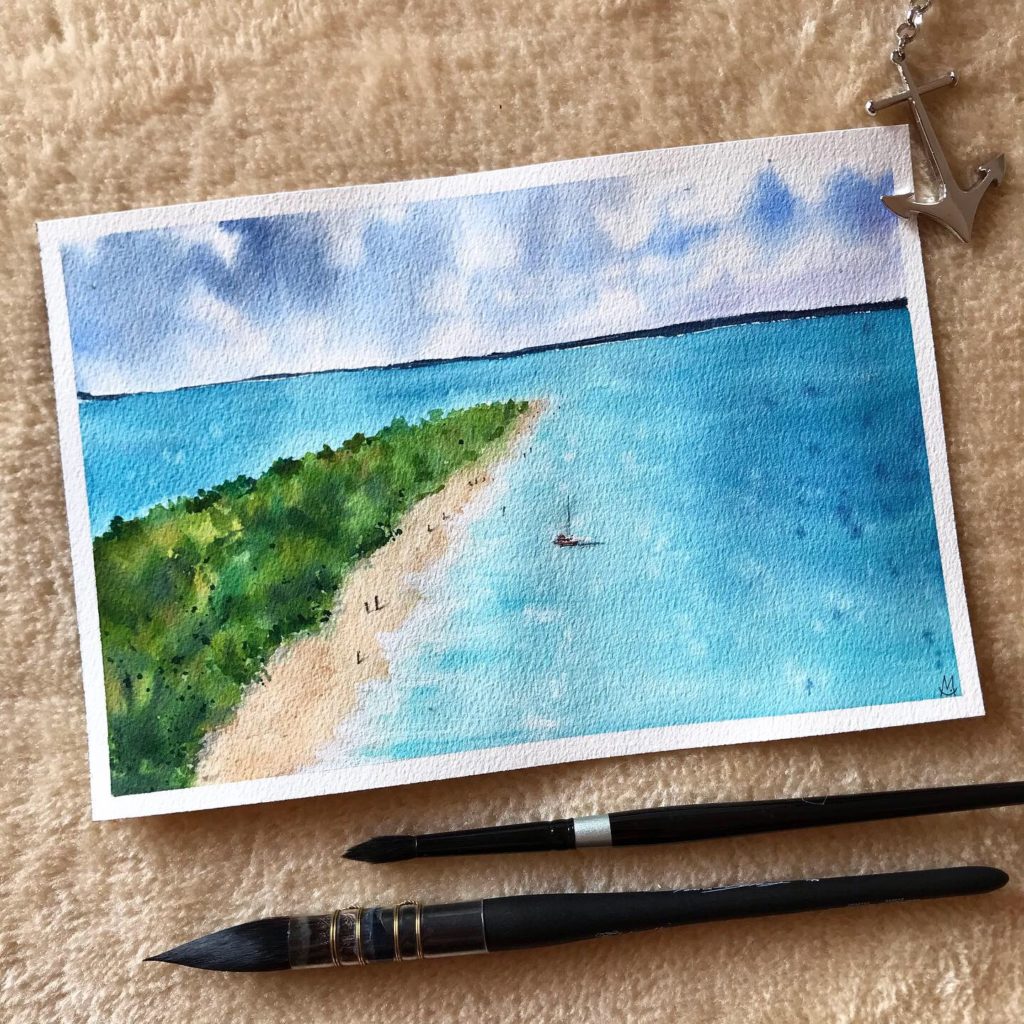
1 – The Sky
- After sketching the landscape, wet the area of the paper where the sky is going to be. Be sure to not put too much water! The surface just needs to be wet and you shouldn’t see any water drops.
- Mix Bright Blue, Cobalt Blue and a bit of Ultramarine. Put the mix on the wet paper making sure you leave some white areas that are going to be our clouds. Optional: add some Violet to te mixture to vary the color of the sky, if you feel like it you can try any other blue-ish or violet-ish shade.
- Darken the upper part with a bit of Payne’s Gray to convey distance and depth.
- Lift some color to shape the clouds and make them more “fluffy”
2 – Sea and Beach
- When the sky is almost dry, wet the sea area making sure you don’t touch the sky you just finished.
- Put a very light wash of a mix of Turquoise, Bright Blue and a bit of Emerald Green for the sea. Darken the farthest areas with a more pigmented Cobalt Blue and Bright Blue.
- For the beach mix Yellow Ochre and a bit of Raw Sienna and Quinacridone Rose.
- Refine the sea adding some lines of a darker blue. This adds the illusion of a deeper sea the more you watch away from the coast. Be super careful when you paint near the beach because yellow and blue can turn into green!
- Add another layer of paint to darken the distant areas some more.
- Now it’s time to have fun, this is my favorite part: splatter some water on the painting with a small brush (the bigger the brush the bigger the splatters) to achieve sparkling water. To do it I suggest you to grab your brush firmly and poke it with your finger. Repeat the process this time using a dark blue instead of clean water paying attention to only let the splatters drop in the distant sea, you don’t want any dark spots near the coast. If you want to be extra safe just cover the area you want to stay clean with another sheet of paper. Let it dry completely.
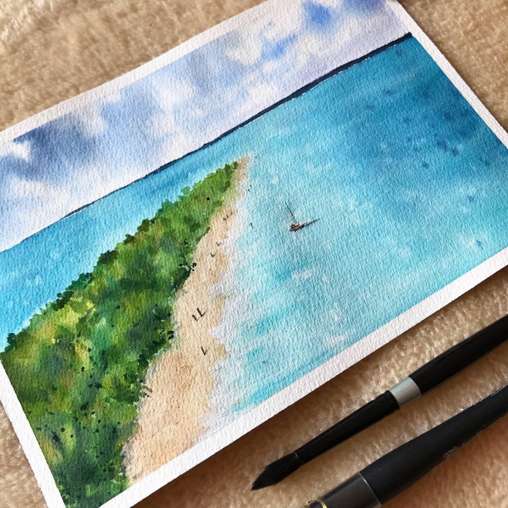
3 – The Island
- Once again wet the island area like you did previously.
- Carefully drag some colors from the beach through the sea.
- Put different kind of greens on the wet area, some of which should be yellow-ish and some others closer to blue-ish green so you can give the flora its light and shadows. I used Olive Green, Green, Chromium Oxide, a Yellowish Green and Emerald Green mixed together (don’t use them all at the same time! Try to create new colors by matching two or three of those at a time)
4 – Distant Lands and Refining
- Take a consistent amount of Indigo with few water to paint the distant lands, we want it to be rock solid.
- Refine the beach with some more color.
- Take White and define the crushing waves.
- Paint some darker areas on the beach and the forest with a mix of crisp and watery brush strokes.
5 – Boat and Waves
- Take English Red to paint the boat paying attention to not put it all over the surface, just leave some white spaces.
- Use a black fineliner to draw the details.
- Define the waves near the beach using a very light touch of Turquoise.
- With a thick amount of White refine the waves, this time you want your brush to catch less water.
6 – People and Final Details
- You can chose to paint people with a brush or a fineliner, I chose the fineliner. Remember to draw everyone with perspective in mind: the farthest ones should be like dots while the nearest acquire more human shapes.
- Draw the shadows with a fast move. Do not overthink it.
- Put some dark green spots in the forest with the splatter technique we used in step “Sea and Beach – Chapter 2”.
- You did it! Congratulations your painting is ready to be signed.
7 – The Result
If you try this painting remember to tag me on Instagram with @chiaramazzetti.art and put the hashtag #chiaramazzettitutorial , i’d love to see what you create!
Music by IKSON
Windy – https://soundcloud.com/ikson/windy-free-download
Verge – https://soundcloud.com/ikson/verge-free-download
Happy Painting!
Chiara
List of watercolor names (based on the brand i used for this painting: White Nights Nevskaya Palitra)