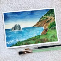


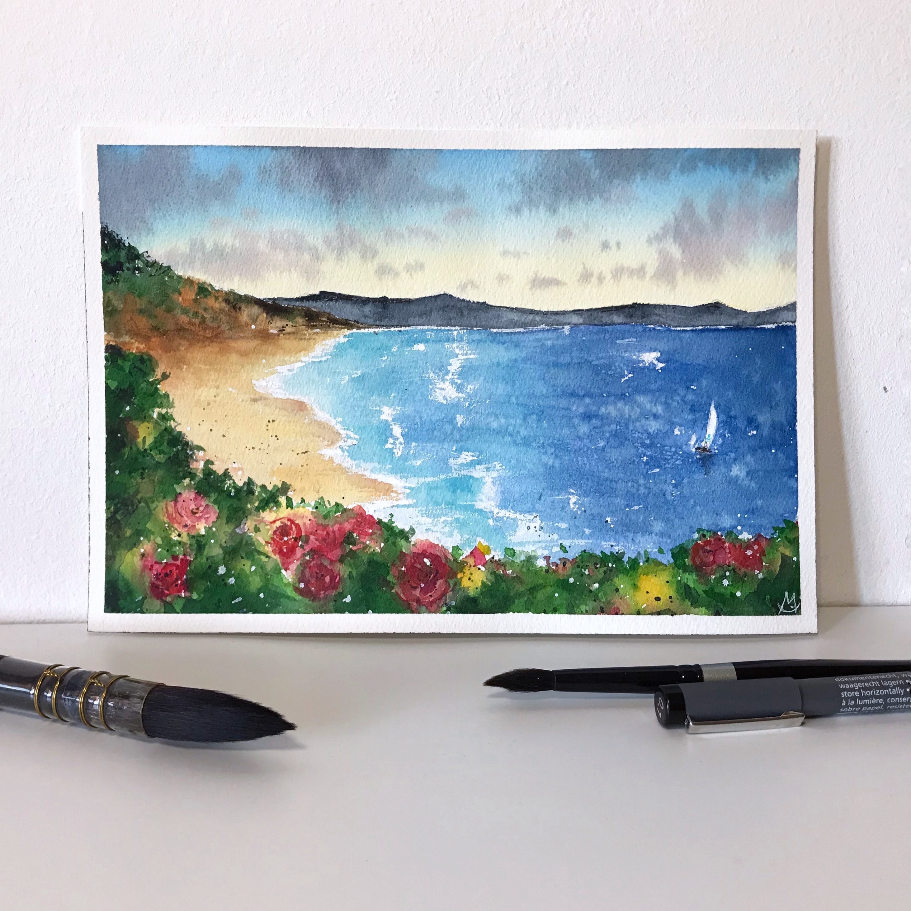
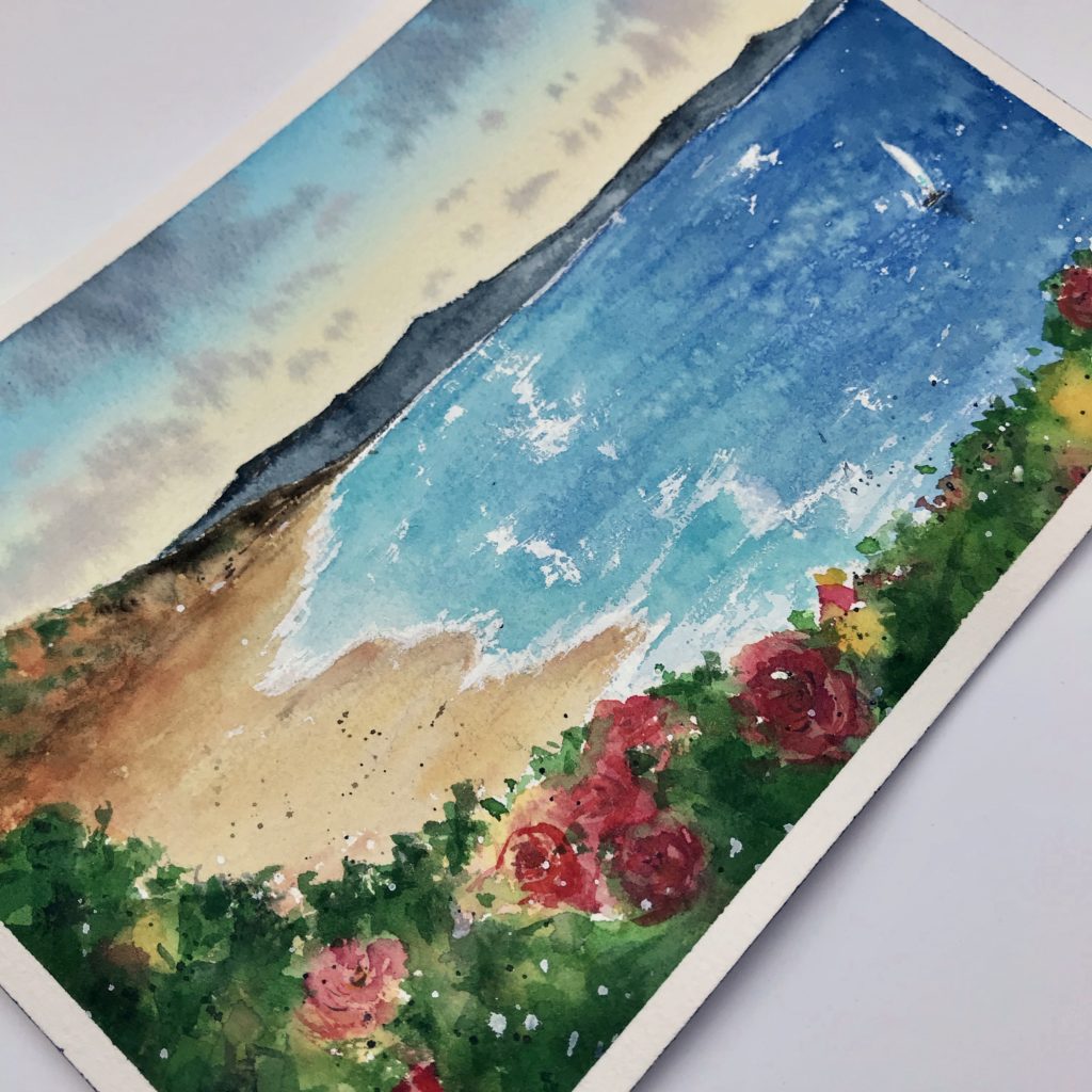
I was thinking about the summer and I realized i wanted to paint a view of the sea from a bush full of scented roses. You know when you get to the beach and you need to make the last few steps to reach the sand? You’re walking down the pathway leading to the shore… Just take that moment and dream about it!
Supplies
1 – The Sky
- With the pencil sketch the landscape and wet the area of the paper where the sky is going to be.
- Prepare Naples Yellow and Cerulean Blue Hue on two different wheels using two different brushes making sure they don’t touch each other. Remember this trick when you’re dealing with yellow and blue to paint a sky because you almost certainly don’t want them to turn into green.
- Apply Naples Yellow from bottom to top and Cerulean Blue from top to bottom a bit at a time one and the other until they reach the center covering the area but not touching. Be super careful in the center, the area where they end up close.
- Darken some parts of the sky adding more color.
- Just before the paper dries up it’s time to paint the clouds, you don’t want the paper to be really wet because that would make your color expand through the sky. Use some Payne’s Gray and paint the clouds with quick and precise strokes. Add some little bit of Magenta and keep going changing the clouds dimensions (I’m using a smaller brush for this one). You can darken some areas adding a little bit of Payne.
2 – Sea and Distant Mountain
- Mix in two separate wheels Ultramarine + Prussian Blue and Cobalt Turquoise + Cerulean. Start from the side of the painting using the darker color till you reach half the area the sea should cover. Continue from this point on reaching the shore using the other, lighter, color. Don’t cover the area of the boat sail and leave some little areas for the splashes of waves.
- Darken the deeper area of the sea with Prussian Blue. You should also be able to create variations with some lighter and some darker strokes.
- With a clean brush that barely touched water remove the excess color to even up the blue.
- Splatter some clean water drops on the color while it’s still wet.
- Put Payne’s Gray on the farthest mountain. You don’t want to paint details but you can let go some bigger drops of color to create darker areas.
3 – The Beach
- Take some Raw Sienna, Burnt Sienna and start to give your hill a good shape. Then use Phtalo Green, Permanent Green and Perm. Green Olive to paint the greenery. You can mix the colors on the paper when they touch.
- Use Naples Yellow to paint the beach leaving the bush area clean. Create variations with lines of Burnt Sienna.
- Paint the clearing with a higher value of green and use Sepia to add details.
- Splatter some dark spots on the beach to create a texture.
4 – Roses, first layer
- Start with the lighter colors, you can use a mix of Naples Yellow and Indian Yellow and paint leaving white spaces. Use some Carmine to create red spots where our roses are going to be. Let the paints flow freely.
- Add Permanent Green with touches of Olive and even them up with the colors on the paper.
- Keep putting green colors on the dry areas to create the bushes.
- Give strength to your flowers adding a more pigmented Carmine.
5 – The Waves
- Pick up a thick quantity of white and define the waves.
- Paint the waves without a precise order, to make them come up more naturally. The closer you get the bigger the strokes, you can even use your finger to blend them.
- Define the edges of the sail.
6 – Roses, second layer
- Let’s get back to our roses. Paint some details with Perylene Violet making “C” shaped strokes to simulate the petals.
- Using a dark green paint the foliage of the bush, letting some lighter areas pop up.
7 – Sailboat and Final Details
- Create a light shadow under the waves near the shore with a touch of watery Payne’s Gray and blend it with the finger if it’s too strong.
- I used Cobalt Turquoise to give a touch of color to the sail, but you can use the one you like the most.
- Use a black fineliner to sketch the boat, don’t add too many details and create a rough shade under the hull with a dark blue.
The Result

- To finish the work i splattered green and white on top of the bush.
- Sign the painting to complete it!
If you try this painting remember to tag me on Instagram with @chiaramazzetti.art and put the hashtag #chiaramazzettitutorial , i’d love to see what you create!
Music by IKSON
Lights – https://soundcloud.com/ikson/
Happy painting!
Chiara
List of watercolor names (based on the brand i used for this painting: Schmincke Horadam)